
Maprix Dashboard | UX
Live device performance overview
Optimized printer fleet dashboard for actionable insights.
Overview
Making sense of printer chaos
Let’s simplify printer management. Many large organizations struggle to track usage, status, and costs across hundreds of printers resulting in inefficiencies and rising expenses. Maprix changes that. Powered by AI, the platform centralizes all printer data into a smart, cloud-based system that helps IT teams monitor fleets, reduce waste, and make faster, data-driven decisions.
I joined the Maprix team to help design a comprehensive yet intuitive solution that meets the complex needs of IoT professionals managing thousands of devices.
Maprix Dashboard | UX
Live Device Performance Overview
Optimized printer fleet dashboard for actionable insights.
Overview
Making sense of printer chaos
Let’s simplify printer management. Many large organizations struggle to track usage, status, and costs across hundreds of printers resulting in inefficiencies and rising expenses. Maprix changes that. Powered by AI, the platform centralizes all printer data into a smart, cloud-based system that helps IT teams monitor fleets, reduce waste, and make faster, data-driven decisions.
I joined the Maprix team to help design a comprehensive yet intuitive solution that meets the complex needs of IoT professionals managing thousands of devices.
the problem
Too many printers. Not enough visibility.
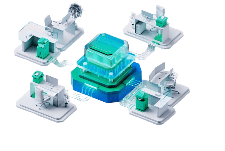
Large organizations face real challenges managing huge fleets of printers. Data like ink levels, paper jams, usage, and maintenance often lives in separate systems or departments making it hard to see the big picture, control costs, or act quickly when something breaks.

IMPLICATIONS
1.
Wasted Time – IT teams spend hours on manual tracking and troubleshooting.
2.
High Costs – Lack of control leads to excessive printing and unnecessary maintenance.
3.
No Instant Feedback – Managers can't see usage trends or inefficiencies across departments.
4.
Missed Issues– Without alerts, small problems turn into major disruptions.
5.
Frustrated Teams – The complexity of managing dozens (or hundreds) of printers causes stress and delays.
the problem
Too many printers. Not enough visibility.
Large organizations face real challenges managing huge fleets of printers. Data like ink levels, paper jams, usage, and maintenance often lives in separate systems or departments making it hard to see the big picture, control costs, or act quickly when something breaks.
IMPLICATIONS
1.
Wasted Time – IT teams spend hours on manual tracking and troubleshooting.
2.
High Costs – Lack of control leads to excessive printing and unnecessary maintenance.
3.
No Instant Feedback – Managers can't see usage trends or inefficiencies across departments.
4.
Missed Issues– Without alerts, small problems turn into major disruptions.
5.
Frustrated Teams – The complexity of managing dozens (or hundreds) of printers causes stress and delays.
The Challenge
One dashboard. Multiple audiences.
The system needed to serve both tech-savvy IT professionals and high-level decision-makers combining detailed insights with simplicity, without overwhelming either side.
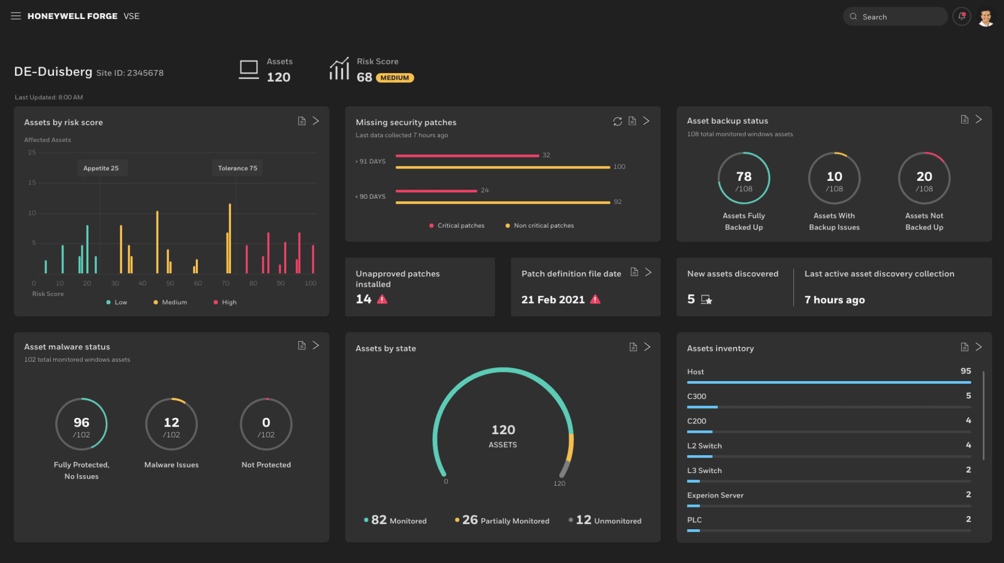
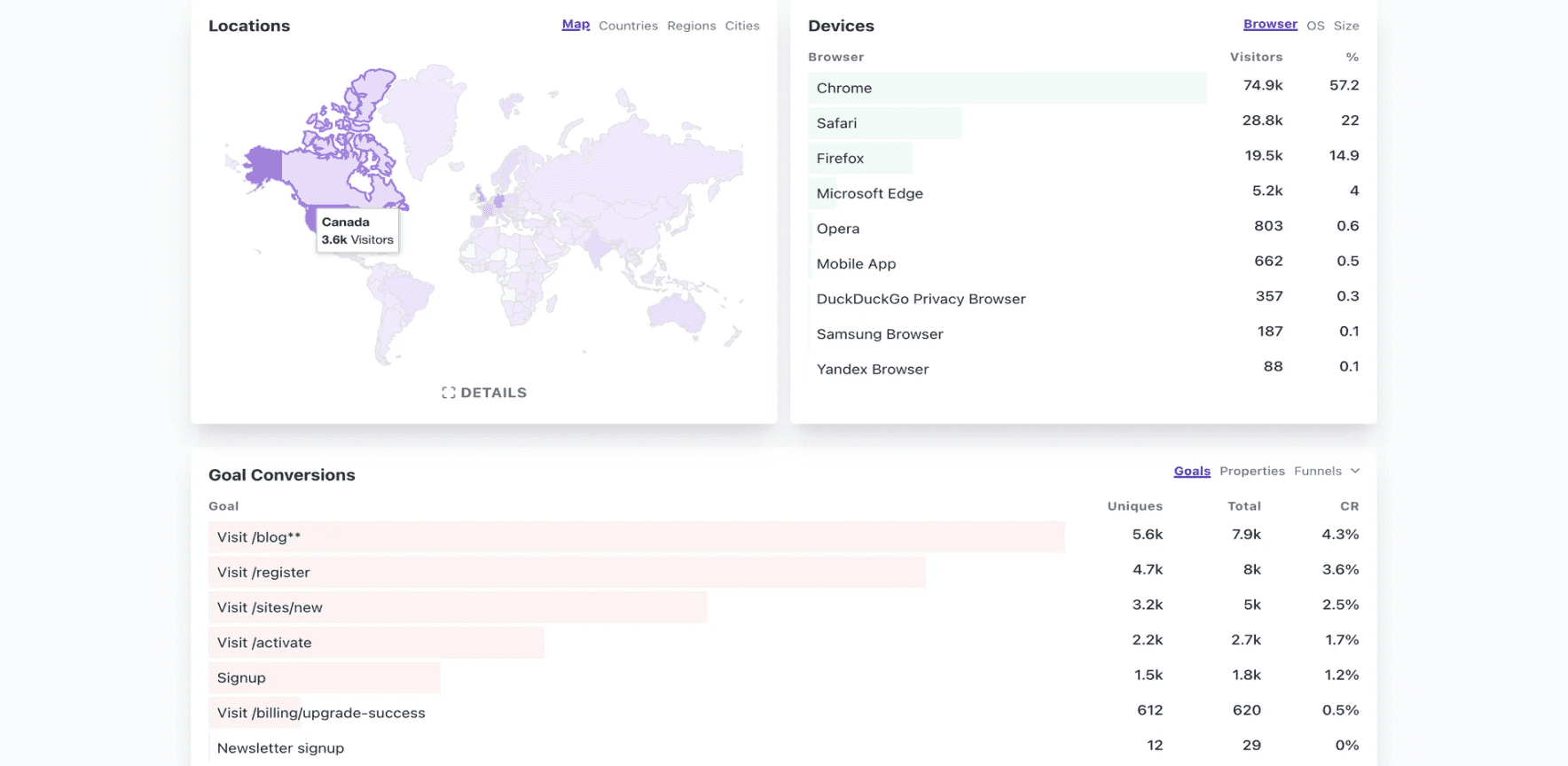
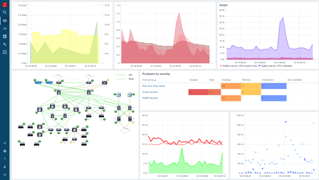
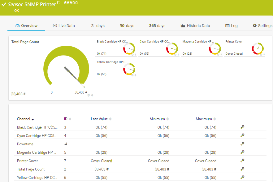
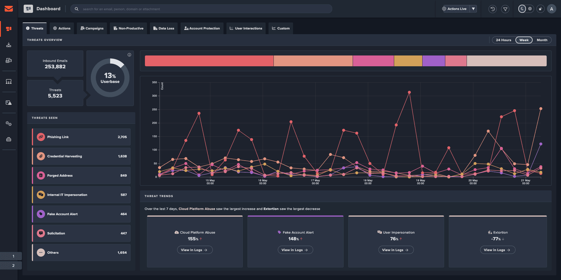
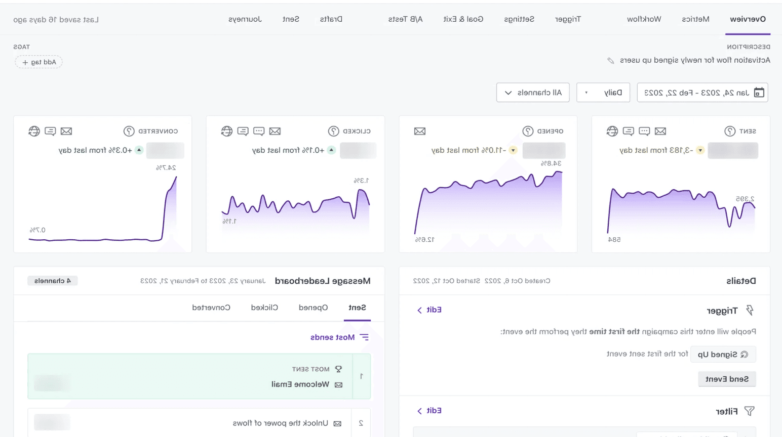
Platforms we analyzed:


As part of our process, we received user insights from the client, which served as a foundational reference. We began by exploring complex IoT solutions, analyzing industry conventions, and reviewing top platforms. These examples helped us understand how other platforms present data, manage complexity, and serve different user needs.

Market Research
From Trends To Takeaways
The Challenge
One dashboard. Multiple audiences.
The system needed to serve both tech-savvy IT professionals and high-level decision-makers combining detailed insights with simplicity, without overwhelming either side.
Market Research
From trends to takeaways
Platforms we analyzed:


As part of our process, we received user insights from the client, which served as a foundational reference. We began by exploring complex IoT solutions, analyzing industry conventions, and reviewing top platforms. These examples helped us understand how other platforms present data, manage complexity, and serve different user needs.
RESEARCH INSIGHTS
Insights that shaped our thinking
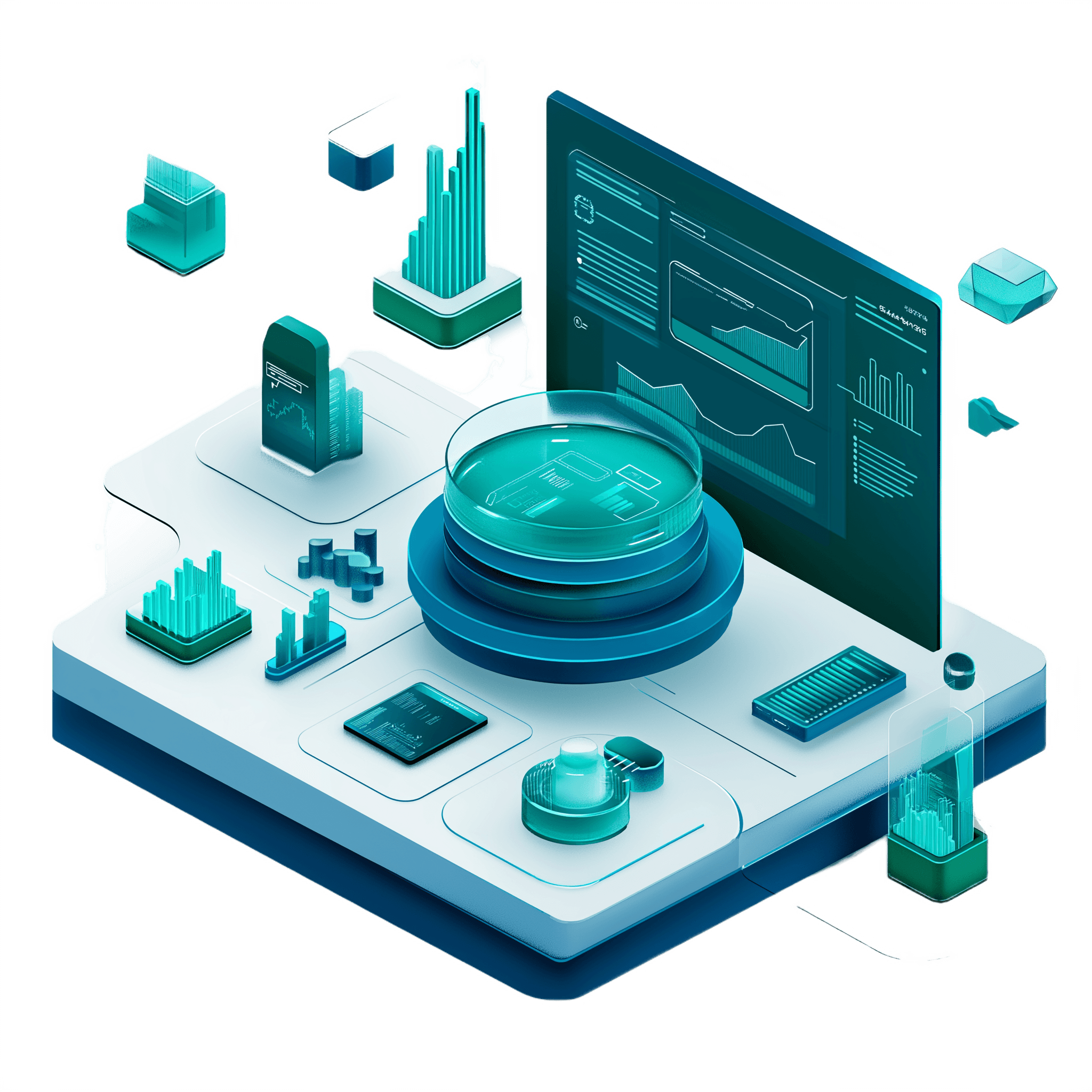
Based on our research, we identified recurring user needs, system expectations, and behavioural patterns that directly informed our UX decisions. These insights helped us shape a system that aligns with user workflows and organizational goals
System Output
Optimizing from the ground up
We began the optimization process by reviewing Maprix’s existing dashboard. Although it provided a basic overview of all printers, it lacked clarity, scalability, and actionable insights. This system served as the foundation for a broader redesign transforming a general interface into a powerful, data-driven tool for enterprise-level fleet management.
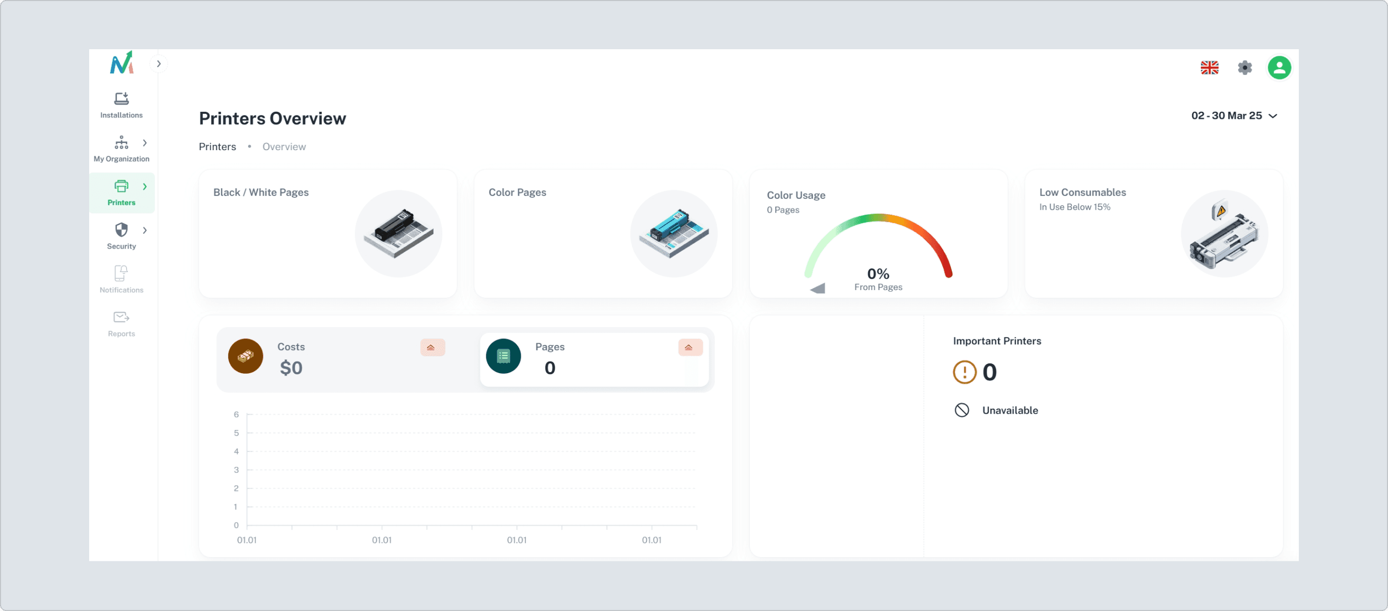
Turning complex data into clear decisions
This section showcases how we translated complex requirements into visual solutions. Each dashboard component was designed to simplify printer management, reduce waste, and help organizations act with confidence.
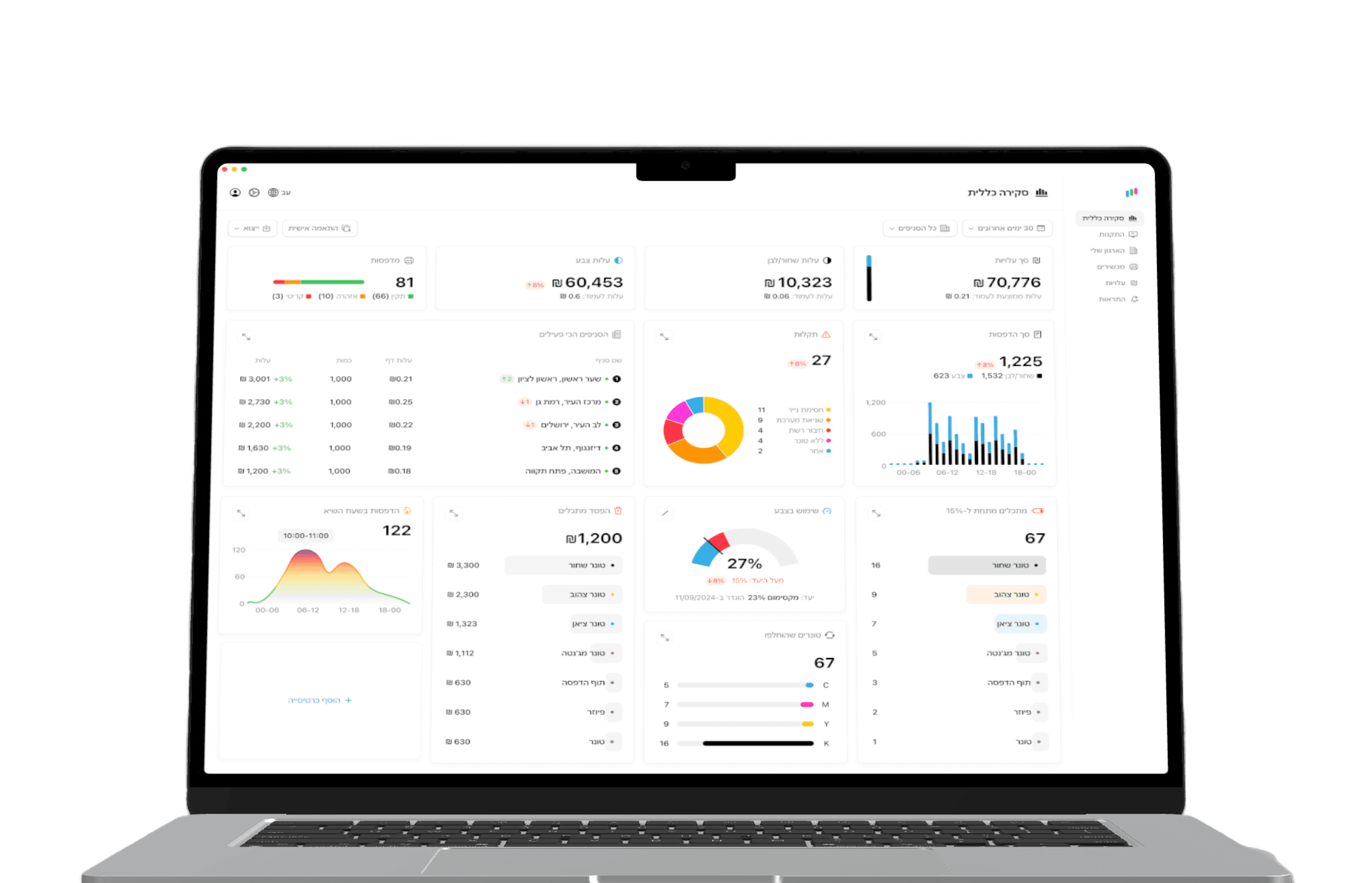
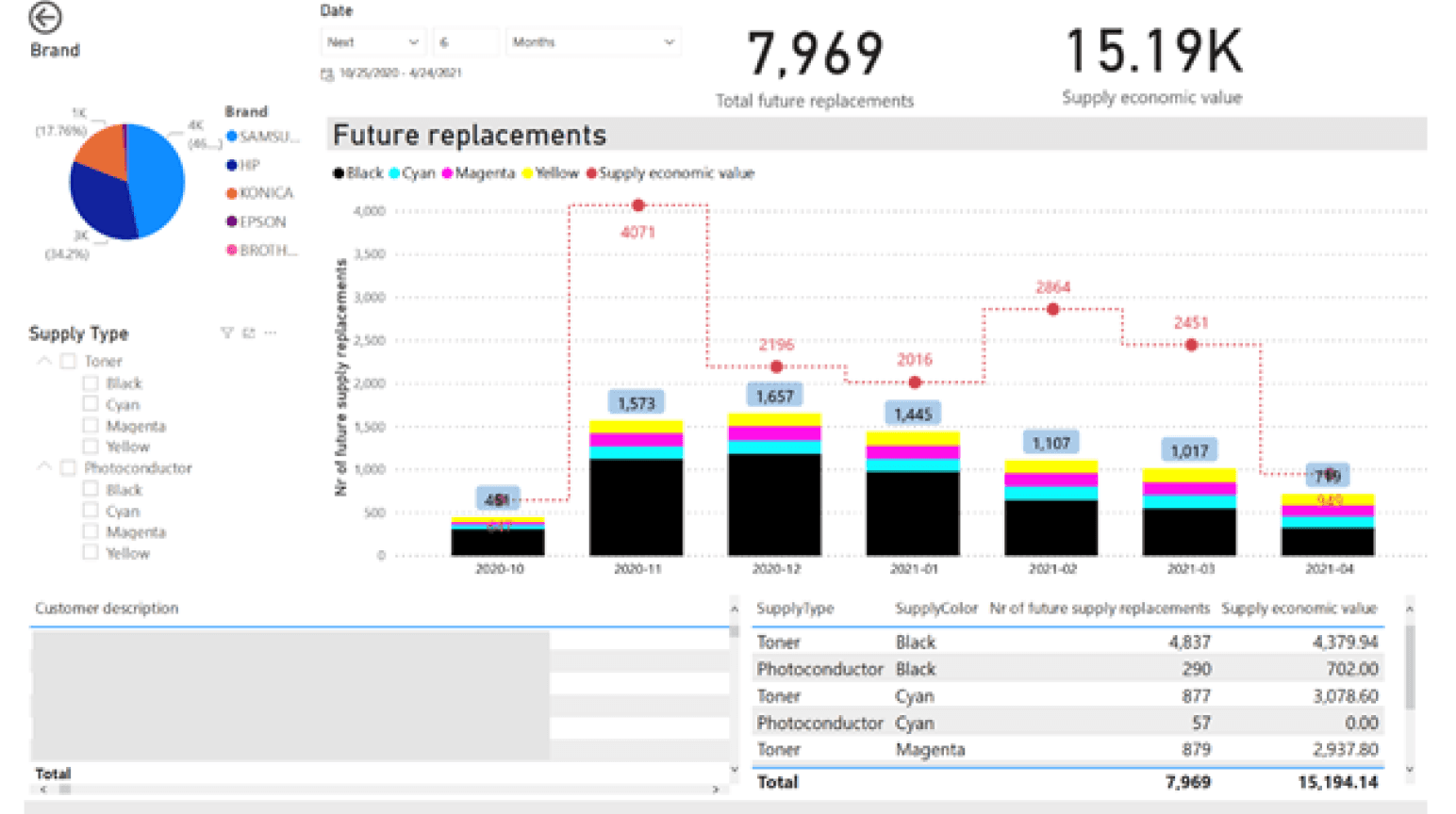
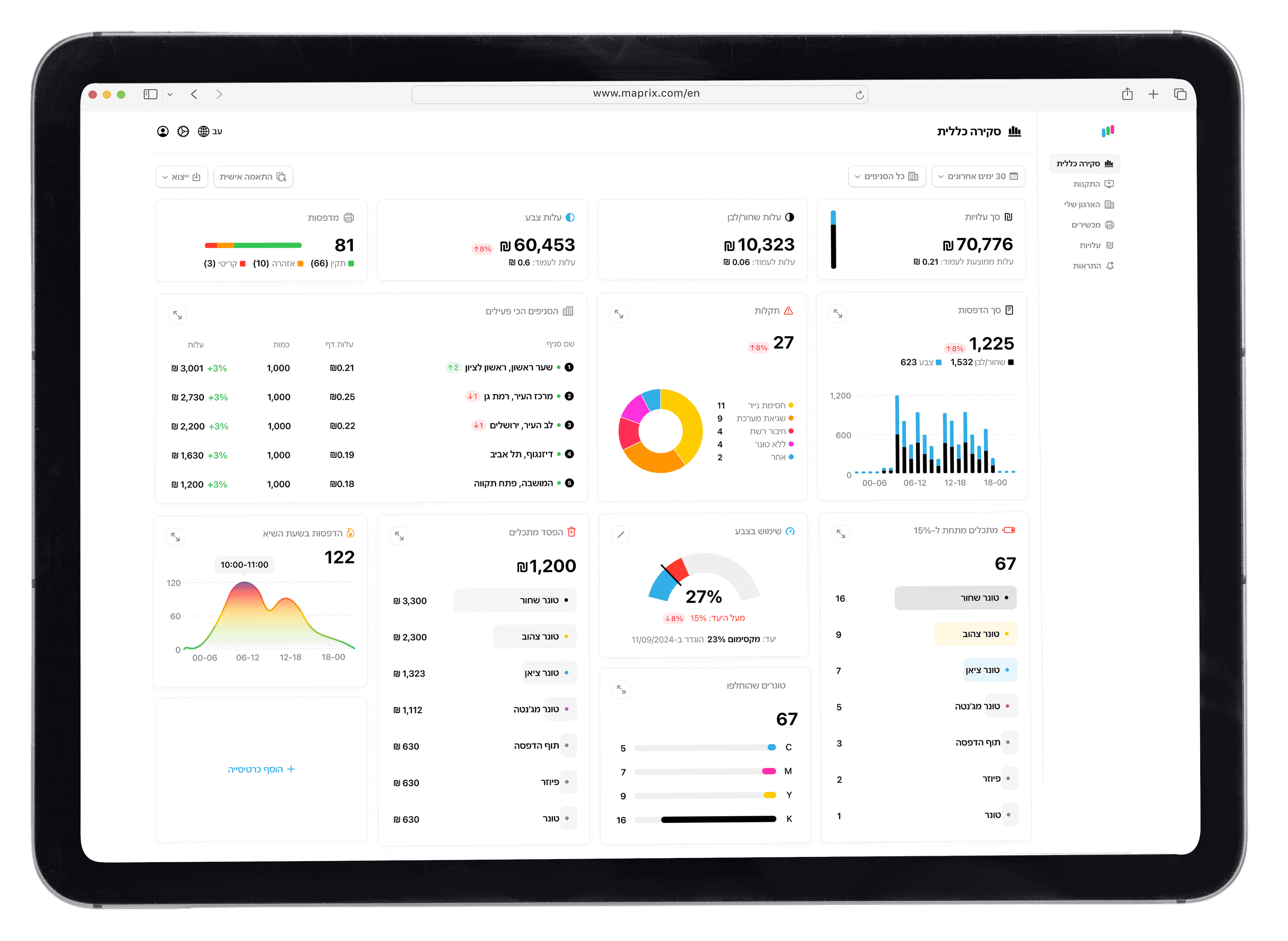
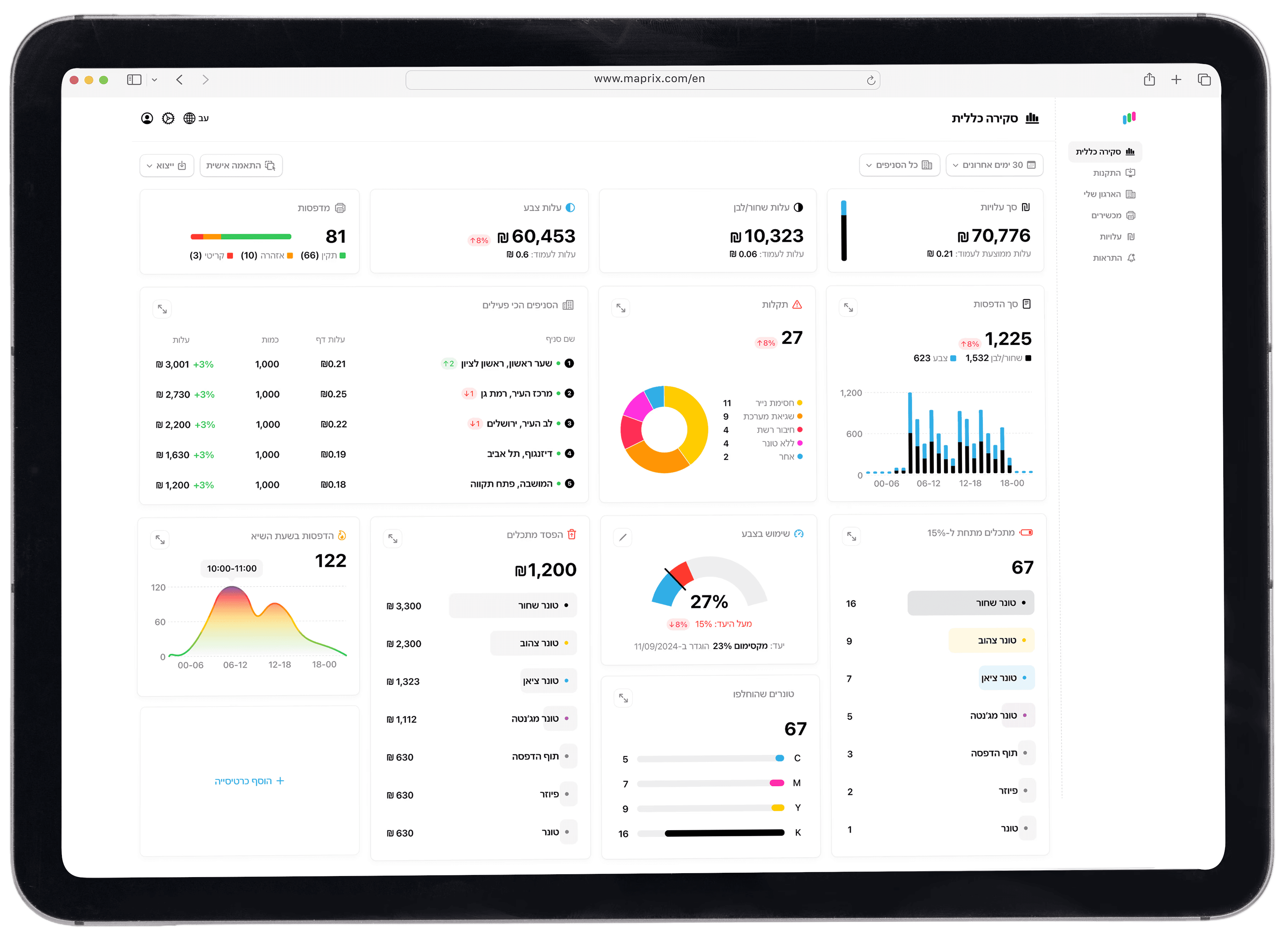
Big Numbers
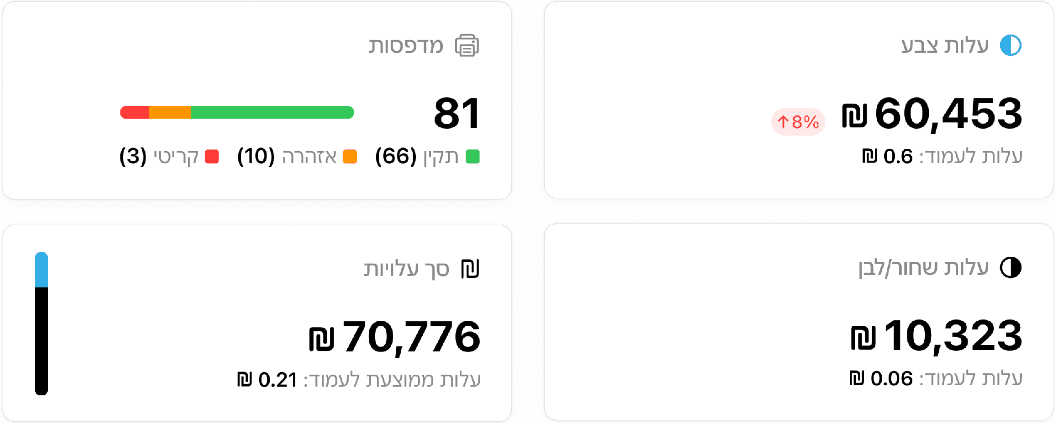
These are the key metrics users need at a glance for an overall view of the system, placed in the top-level hierarchy for immediate review.
Table
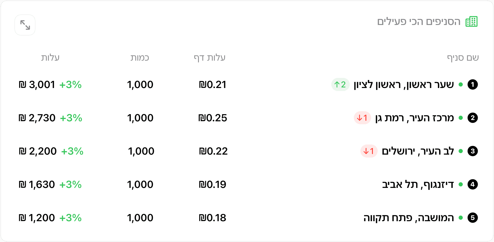
This table displays the branches with the highest printing activity over the selected timeframe, showing total cost and cost per page. Because there’s a high volume of data, a tabular format makes it easy to scan and visually clear.
Pie Chart
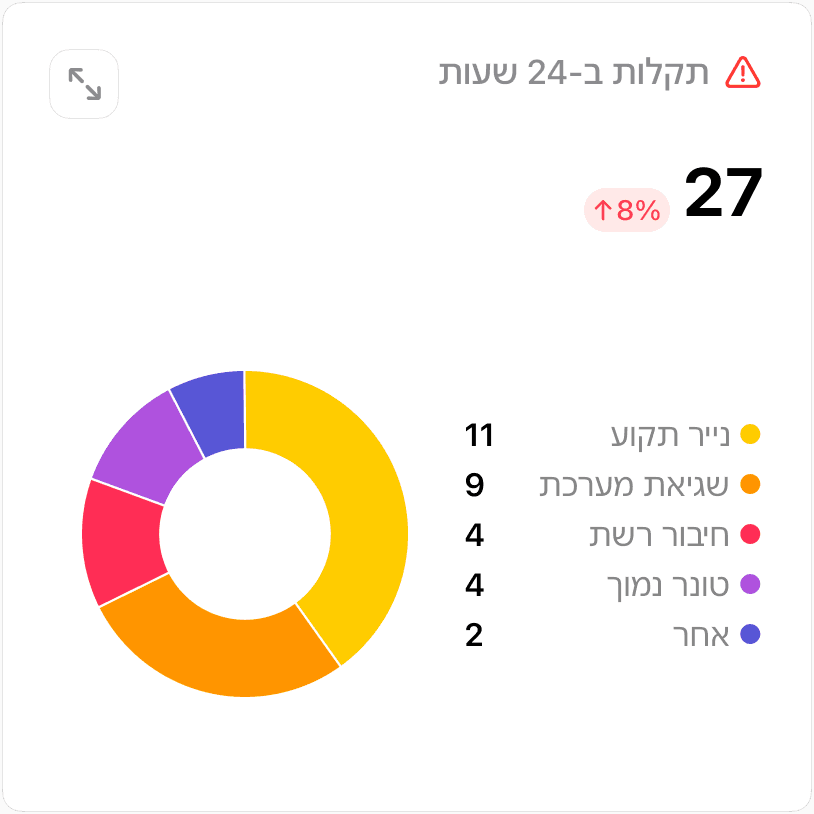
Provides a visual overview of the distribution and types of malfunctions.
This view enables immediate identification of the main issues and highlights the breakdown among various categories.
Stacked Chart
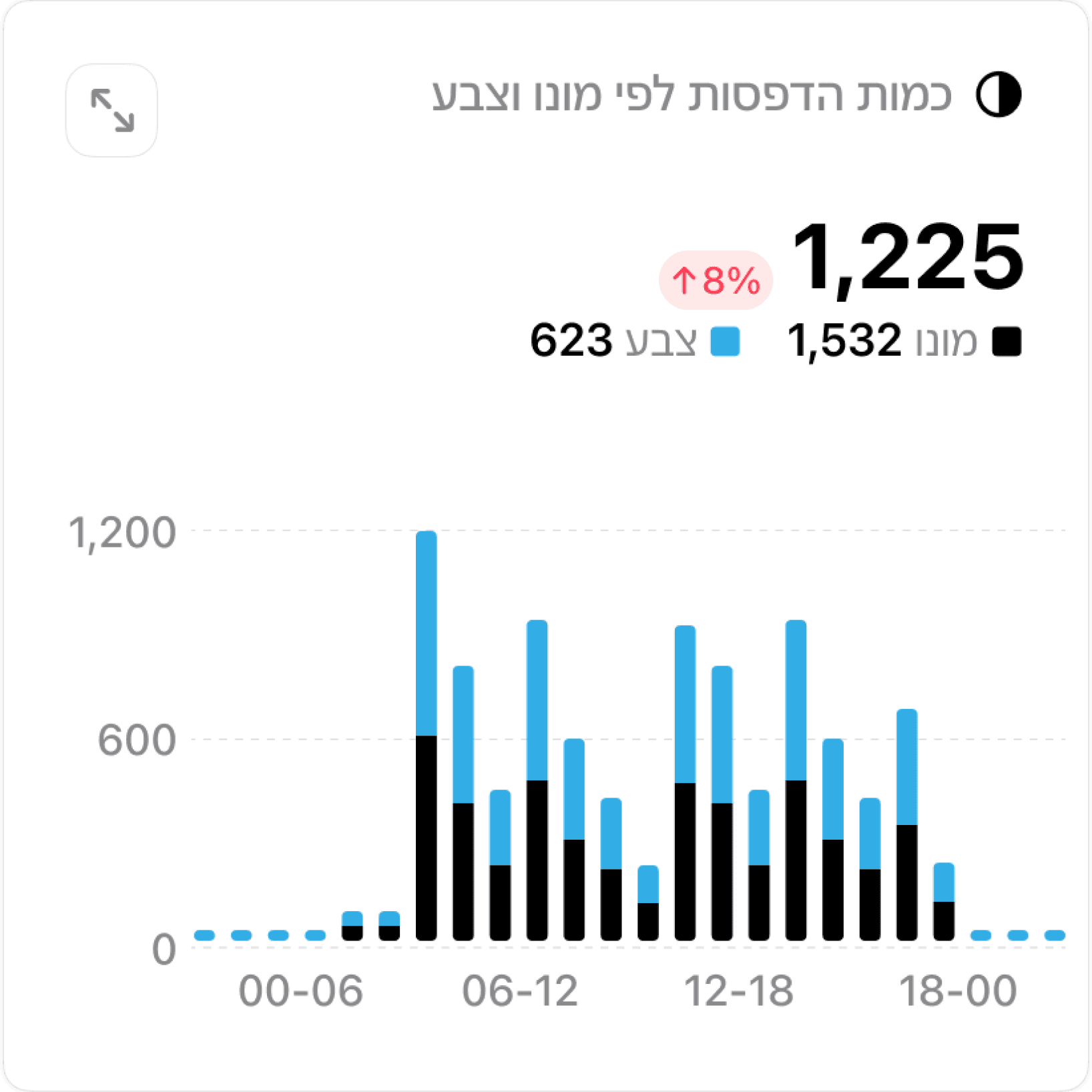
This chart compares monochrome and color printing volumes across different time intervals, providing a quick overview of usage patterns throughout the day.
Targeted Recognition
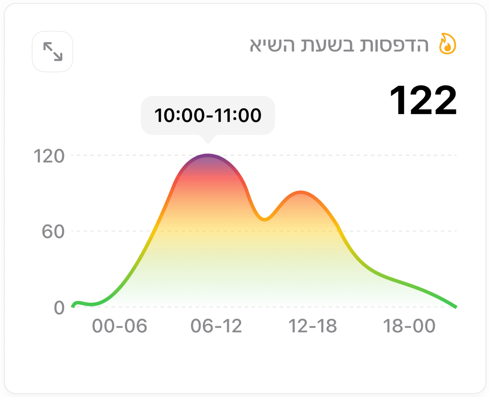
This gradient line chart visualizes printing activity throughout the day, emphasizing peak usage hours and helping managers plan resources effectively.
Gauge Bar
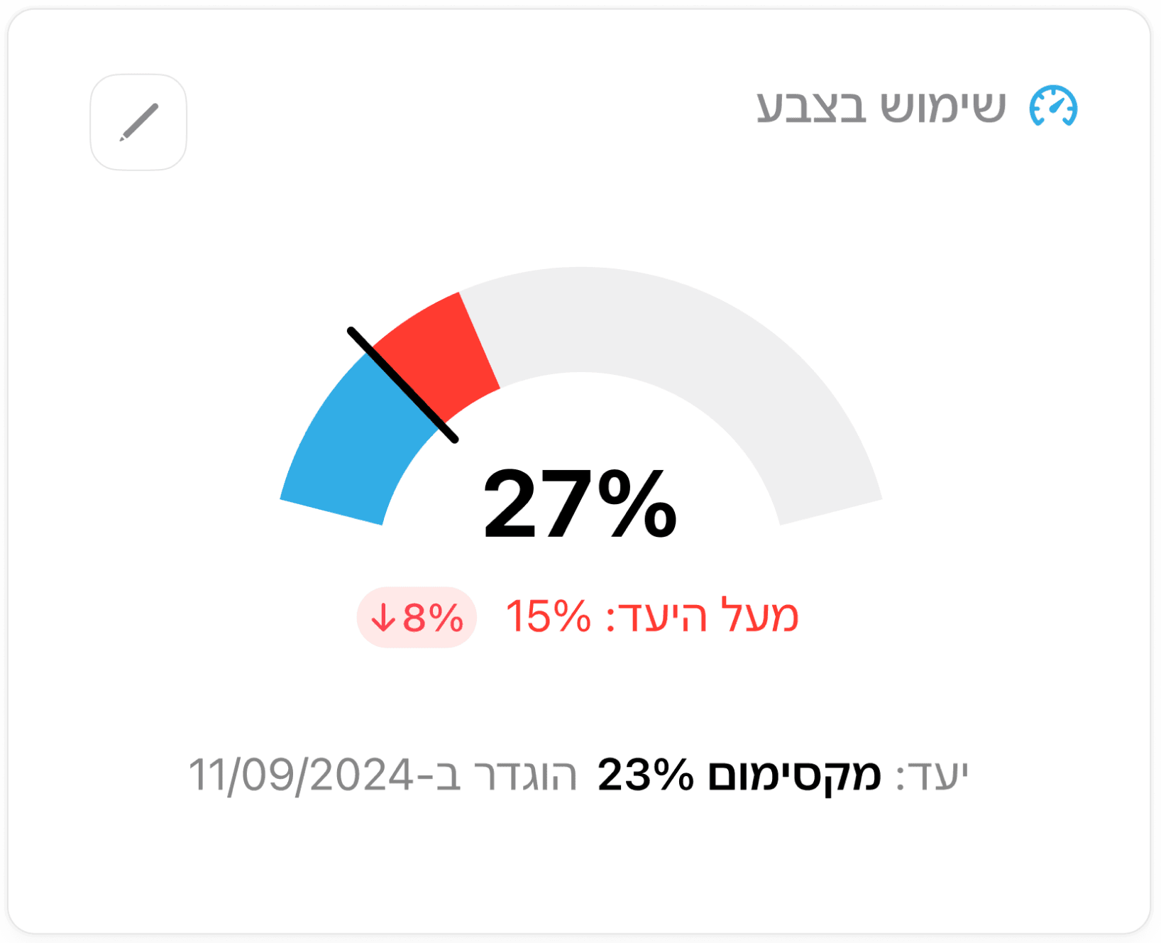
This gauge chart compares current color usage to a defined maximum target, spotlighting both the percentage (27%) and any deviation in real time. Bold color segments and a central value help users instantly see whether they’re exceeding or meeting their goal.
Progress Bar
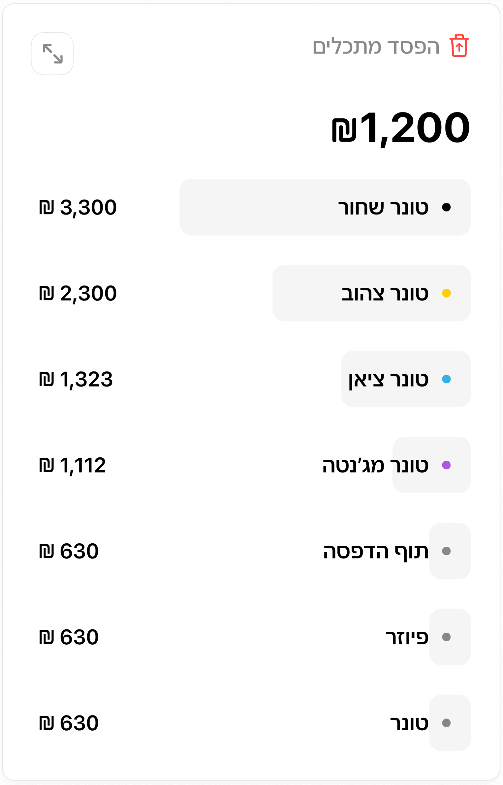

This table displays the branches with the highest printing activity over the selected timeframe, showing total cost and cost per page. Because there’s
a high volume of data, a tabular format makes it easy to scan and visually clear.
Full System View
After breaking down the system into focused components, we brought it all together in a centralized dashboard giving teams one clear, scalable view of everything they need to manage, analyze, and optimize printing at scale.
What's Next
Looking ahead
Building on the success of the printer dashboard, we began exploring how the Maprix system could be adapted to monitor organizational computers. The vision: a smart platform that detects unused software, predicts failures, and tracks hardware performance. While early design concepts were explored, the project is currently paused due to funding limitations.
System Output
Optimizing From The Ground Up
We began the optimization process by reviewing Maprix’s existing dashboard. Although it provided a basic overview of all printers, it lacked clarity, scalability, and actionable insights. This system served as the foundation for a broader redesign transforming a general interface into a powerful, data-driven tool for enterprise-level fleet management.
RESEARCH INSIGHTS
Insights that shaped our thinking
Based on our research, we identified recurring user needs, system expectations, and behavioural patterns that directly informed our UX decisions. These insights helped us shape a system that aligns with user workflows and organizational goals.
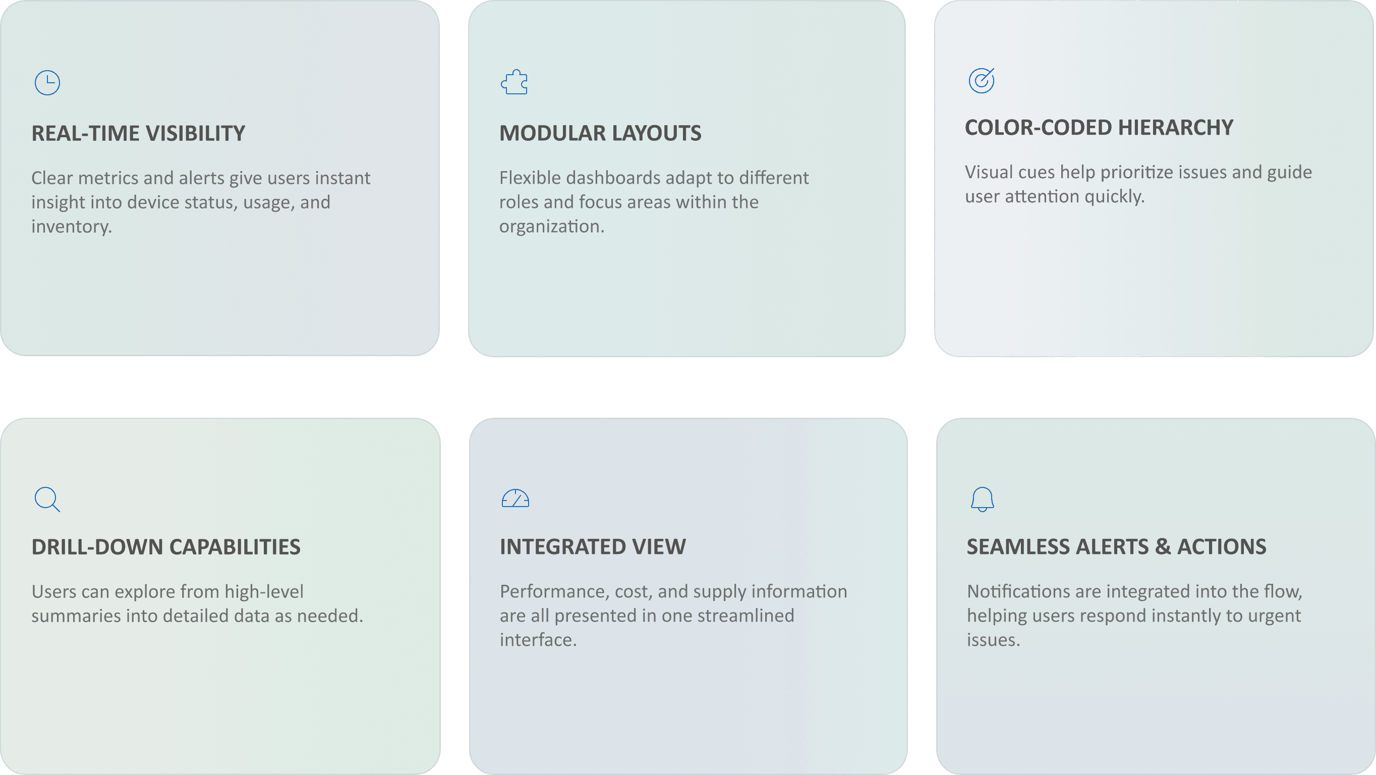
Real-Time Visibility
Clear metrics and alerts give users instant insight into device status, usage, and inventory.
Modular Layouts
Flexible dashboards adapt to different roles and focus areas within the organization.
Color-Coded Hierarchy
Visual cues help prioritize issues and guide user attention quickly.
Drill-Down Capabilities
Users can explore from high-level summaries into detailed data as needed.
Integrated View
Performance, cost, and supply information are all presented in one streamlined interface.
Seamless Alerts & Actions
Notifications are integrated into the flow, helping users respond instantly to urgent issues.
This section showcases how we translated complex requirements into visual solutions. Each dashboard component was designed to simplify printer management, reduce waste, and help organizations act with confidence.
Turning complex data into clear decisions
Big Numbers
These are the key metrics users need at a glance for an overall view of the system, placed in the top-level hierarchy for immediate review.
Table
This table displays the branches with the highest printing activity over the selected timeframe, showing total cost and cost per page. Because there’s a high volume of data, a tabular format makes it easy to scan and visually clear
Pie Chart
Provides a visual overview of the distribution and types of malfunctions.This view enables immediate identification of the main issues and highlights the breakdown among various categories.
Stacked Chart
This chart compares monochrome and color printing volumes across different time intervals, providing a quick overview of usage patterns throughout the day.
Targeted Recognition
This gradient line chart visualizes printing activity throughout the day, emphasizing peak usage hours and helping managers plan resources effectively.
Gauge Bar
This gauge chart compares current color usage to a defined maximum target, spotlighting both the percentage (27%) and any deviation in real time. Bold color segments and a central value help users instantly see whether they’re exceeding or meeting their goal.
Progress Bar
This table displays the branches with the highest printing activity over the selected timeframe, showing total cost and cost per page. Because there’s a high volume of data, a tabular format makes it easy to scan and visually clear
Full System View
After breaking down the system into focused components, we brought it all together in a centralized dashboard giving teams one clear, scalable view of everything they need to manage, analyze, and optimize printing at scale.
What's Next
Looking Ahead
Building on the success of the printer dashboard, we began exploring how the Maprix system could be adapted to monitor organizational computers. The vision: a smart platform that detects unused software, predicts failures, and tracks hardware performance. While early design concepts were explored, the project is currently paused due to funding limitations.